
Helvetica
- warm
- slow-burn
- gentle
- intimate
Warm, slow-burn, gentle documentary / space, grounded in texture. Ambivalent, intimate, cold.
How every film is hand-scored →Helvetica is a feature-length independent film about typography, graphic design and global visual culture. It looks at the proliferation of one typeface (which will celebrate its 50th birthday in 2007) as part of a larger conversation about the way type affects our lives. The film is an exploration of urban spaces in major cities and the type that inhabits them, and a fluid discussion with renowned designers about their work, the creative process, and the choices and aesthetics behind their use of type.
Our read · Helvetica (2007) reads as a warm, slow-burn, grounded documentary · space entry — gentle in intensity, intimate in scope, cold in temperature, ambivalent in outlook.
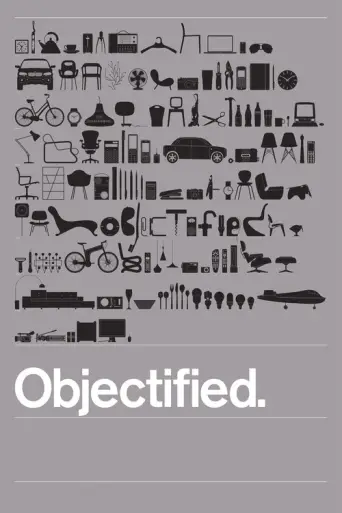

More info & search links
The shape of Helvetica
What watching it is actually like.
“You want a sleek design nerd-out on fonts, cities, and visual culture.”
Skip it tonight — Skip if typography documentaries sound like homework after 10pm.
The reading.
Each axis is hand-scored — not derived from votes or genre averages. The marker shows where this film sits; the gradient fill uses the film's own cinematography palette.
Eight films that read most like this one.
Closeness in the twelve-axis space — how the film actually reads, not “people also liked.”
All films like Helvetica — ranked, with why →


Discussion
What does your Movie DNA look like?
Rate a few films you've seen. We map your taste across the same twelve axes and find the films you'll actually want to watch tonight.
Read my taste — 60 sec